How to Create Landing Pages that Convert

Table of Contents
Wanna sell something online? You’re going to need landing pages that convert. Here’s what to know before you build yours.
We all know that every successful business has a website. But did you know that the landing page is the most critical element of the site? That one page gives the first impression of what you offer and is the best marketing tool you’ve got. That one page determines whether you will be successfully received or clicked away to another site.
What is a Landing Page?
A landing page is simply a web page in which you send traffic to after a person clicks on a QR code, a tweet or email URL. It can be but is not necessarily your company’s home page. In fact, marketing experts recommend it is not just a home page since this landing site is a critical component in what influences the visitor to stay on your website.
Also read: Website vs Landing Page
Why Use a Landing Page?
There are dozens of reasons to use a landing page. Today’s post will focus on three reasons you want to consider this vital marketing tool, and simple ways you can easily make creating a landing page a reality.
- 1. Branding You have only a few seconds to get a visitors attention and keep them on your website. The landing page is a critical way to engage and promote your business brand. You want to create a page that tells your story visually and creatively.
- 2. Analytics Creating a landing page that is trackable is the best way to gain information about who is visiting your website, where the traffic is coming from, and how long each person is clicking through to other elements of your website. This data helps you determine what’s working on the landing page and what needs to be improved.
- 3. Targeted Marketing The beauty of landing pages is they can be created for specific marketing campaigns. This works great if your market is segmented into a few different niches. And by testing various campaigns and customized landing pages, you will see what messages connect with prospects. Thus allowing you to target future marketing with a more successful approach.
Landing Page Design Tips
1. Keep It Simple and Focused on Solving a REAL and PAINFUL Problem
Your landing page should be simple and to the point. You don’t want to overwhelm visitors with too much information. You only need to focus on a real and painful problem your target audience wants to fix.
It doesn’t have to be beautiful – in fact, ugly pages often convert better than professionally designed pages.
2. Sell the Hole and Not the Shovel
Make your offer the “DESIRED OUTCOME” or result and not the actual thing you’re selling.
For example, a “fitness” offer would be “Look your best for the holiday season”.
Put yourself in your customer’s shoes and make a list of all the things they want, why they want them and what’s getting in the way.
“Look like you did in high school in time for your reunion – without going to the gym or eating cardboard”
3. Include a SINGLE Call to Action At the Top, Middle and Bottom
A landing page is designed to do ONE thing – collect leads or sell something. Hence it has only ONE call to action; to sign up, buy now, order now, register, etc. One call to action going to the SAME page.
Make sure that your call to action appears multiple times throughout the page; above the fold, in the middle and at the end of the page.

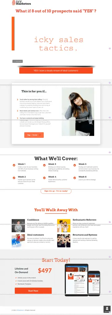
How many calls to action do you see here? Notice how every section has its own call to action.
4. Use a Countdown Clock
A countdown clock builds on the “urgency factor” which can 5x your conversions. According a CXL case study, adding a countdown timer increases his conversion rate from 2.5% to 10.8%.
Most landing page builders (LeadPages, Unbounce, WordPress, Elementor) offer a countdown clock feature or plugin that you can use.
Most Flexible

Keep in mind that you’ll get two choices with your countdown clock; one that resets every time someone lands on the page, and another one that remembers the last time they were on the page and counts from the first time they were on the page.
5. Images to Use on Your Landing Page
Images can help make your landing page more visually appealing and can help explain your product or service. So make them count.
- Use an image of YOURSELF — if you are selling coaching, consulting, your process or thought leadership
- Use images of your product or what’s included. If you are offering a book, workbooks, etc, include images of what someone will be getting.
- Provide images of any software dashboards, etc.
- Use statistics or research if it supports your case – to show contrast.
- Emotional images – that show people before and after or someone using the product
- Feature the desired outcome
6. Testimonials
Speaking of images, use visual testimonials.
If you have testimonials from happy customers, be sure to include them on your landing page. This will help build trust with potential customers.
Make sure that you collect headshots of your customers, or even better, collect video testimonials.
7. Videos
Landing pages with videos can increase your conversions by 86%. So, it’s a great idea to include a video above the fold and even as testimonials.
I’ve noticed that landing page builders have moved away from the video design and I’m not sure why because conversions with video are STILL higher than without.
But, what if you don’t like yourself on video? Don’t worry – you don’t have to be on the video, you can also do something called a video sales letter.
Here’s an example of a page where I did that.

8. Use AB Testing.
AB testing is a great way to test different versions of your landing page to see which one performs the best. This can help you fine-tune your landing page to make it as effective as possible.
Creating an effective landing page is important if you want to convert visitors into leads or customers.
Key Takeaway: Use simple, effective landing pages to convert visitors into leads or customers.
Why You Need a Landing Page
Why?
Because a landing page is the best way to convert visitors into leads and customers. There are a lot of different ways to create a landing page, but the most important thing is to make sure that it’s designed to convert.
That means including a strong headline, compelling copy, and a clear call-to-action. If you’re not sure how to create a landing page that converts, there are a lot of great resources out there to help you.
But the bottom line is that if you want to grow your business, you need a landing page.
How to Create an Effective Landing Page
As a small business owner, you are always looking for ways to market your products or services on a tight budget. Creating an effective landing page can be a great way to do this.
But what makes a landing page effective?
There are a few key elements that you will want to include in your landing page in order to make it as effective as possible. First, you will want to make sure that your headline is clear and concise.
This is the first thing that visitors to your page will see, so you want to make sure that it grabs their attention and tells them what they can expect to find on your page. Next, you will want to include a strong call to action.
This is what will encourage visitors to take the next step, whether that is signing up for your email list, making a purchase, or downloading a freebie. Make sure that your call to action is clear and easy to follow.
Finally, you will want to include a form on your landing page so that you can capture leads. This is an important step in the sales process, so you want to make sure that your form is easy to fill out and that it includes all of the necessary information.
Key Takeaway: To create an effective landing page, make sure to include a clear headline, strong call to action, and lead capture form.
of resources and tools available that can help. There are also a number of companies that specialize in designing and optimizing landing pages.
When it comes to increasing your conversion rate, it’s important to test different elements of your landing page and to constantly be optimizing for better results.
Key Takeaway: To create a high-converting landing page, make sure to include a strong headline, a clear call-to-action, targeted content, and a strong offer.
FAQ’s in Relation to Create Landing Pages That Convert
Why are my landing pages not converting?
There are many potential reasons why your landing pages are not converting. It could be that your offer is not compelling enough, or that your copy is not clear and concise.
It could also be that your page design is not effective in guiding visitors to take the desired action. Landing pages need to be carefully crafted in order to be successful.
If you’re not sure why your pages aren’t converting, consider AB testing different elements to see what makes a difference.
What is a conversion landing page?
A conversion landing page is a page that is designed to get visitors to take a specific action, such as subscribing to a newsletter, downloading a white paper, or making a purchase.
The page typically includes a strong call-to-action and persuasive copy that encourages visitors to take the desired action.
What is a good conversion rate for a landing page?
A good conversion rate for a landing page is typically around 2-5%.
Conclusion
Landing pages that convert are the most powerful element of your
And here’s the best part! You don’t need tech skills or fancy software. You can use a simple low-cost landing page builder and if you have the basics of your marketing message and offer laid out, you can be selling in minutes.


