A small change to U.S. quarters is a big trend in logo design

By James I. Bowie 3 minute Read
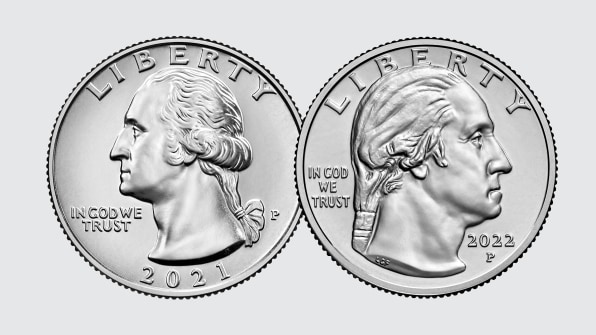
One change to the U.S. quarter this year has gone mostly unnoticed. The portrait of George Washington on the coin, which had faced left since its first appearance in 1932, flipped to face right in 2022. Based on internet chatter, the recent barely-perceptible tweak to Instagram’s logo attracted much more attention. But the about-face on the quarter reflects a large trend in American logo design over the past century.
what the hell happened to the instagram icon
why are the colors oversaturated now (left is the new icon) pic.twitter.com/N3DiQGmEBG
— Nick C. (@nickisonlinet) May 16, 2022
The new portrayal of Washington is a design by American sculptor Laura Gardin Fraser that had been recommended in 1931 to adorn the coin, but was snubbed in favor of John Flanagan’s left-facing offering. This year’s change features her design in conjunction with the U.S. Mint’s American Women Quarters Program, which honors distinguished American women, including poet and author Maya Angelou and women’s voting rights activist Adelina “Nina” Otero-Warren, with designs on the tails side of the coin. Somewhat ironically, Fraser’s Washington appears more masculine and less fussy than Flanagan’s.

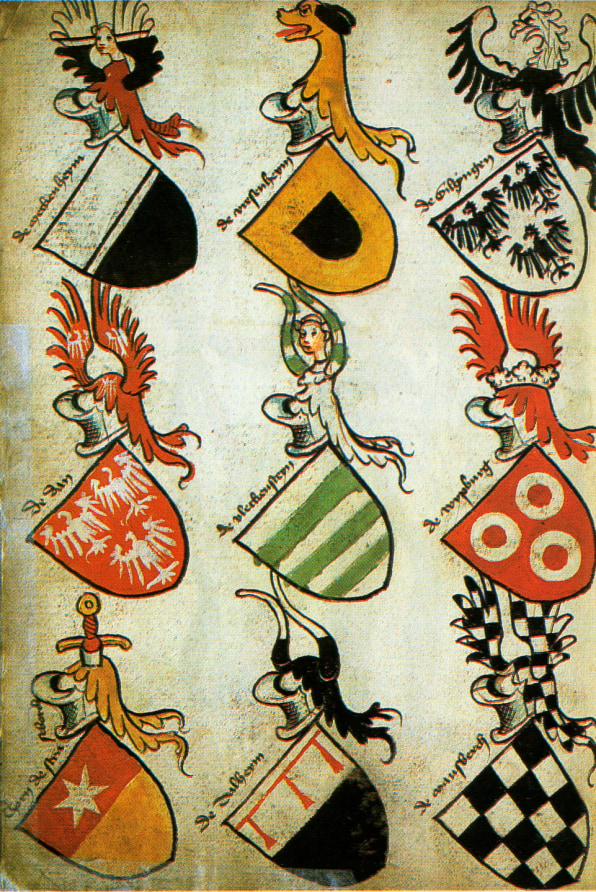
Going left used to be the norm—on currency and on corporate logos. In the early 20th century, as marketing and branding began their development, the design of many logos was based in the centuries-old traditions of heraldry. One of these was that figures on a heraldic shield should face the viewer’s left, because that was the shield-bearer’s right, and it was his perspective, not the eye of the beholder, that mattered.

These ancient heraldic rules tripped up some American companies. In 1925, Graybar Electric, a Midwestern company that sells telecommunications equipment, discovered to its horror that the line on its shield logo was tilted the wrong way, making it a “bar sinister,” or symbol of illegitimacy, in the language of heraldry. It quickly changed its logo.
But over the years, right-facing marks have won out. By 1960, a survey conducted by the Opinion Research Corporation showed that Americans overwhelmingly viewed rightward logos more positively than their opposites. Perhaps it’s only natural in a culture where we read from left to right, but logos facing right were also seen as moving “forward.” By 1978, corporate identity legend Wally Olins was bemoaning the cliché of logos “ending with an arrow, preferably pointing upwards and slightly to the right, indicative of Progress, Dynamism and a controlled but powerful thrust towards what is clearly a Better and Brighter Future.” (And this was well before Amazon‘s smile logo and Target’s Up & Up brand.) No one cared that these marks were all “bar sinister.”
Unlike the shields of heraldry, companies also placed emphasis on how logos appeared to the viewer, rather than the user. For instance, Apple discovered that while its logo on its laptops would face the user when they opened the computer, it would then appear upside-down to onlookers. So, the company subsequently flipped the symbol.

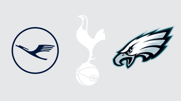
Today, there are some notable logos, particularly those depicting birds, that still uphold the heraldic leftward tradition: Lufthansa, Tottenham Hotspur, Japan Airlines, the Philadelphia Eagles (the only left-facing National Football League symbol). Similarly, it’s worth noting that the eagle that graced the back of the U.S. quarter until 1998 was a lefty.
But in general, right-facing logos now predominate. Of the 62 Fortune 500 logos that can be said to be facing or moving laterally, 82% go right. It’s the left-facing exceptions that are interesting. Some, like Goodyear and John Deere, have been leftward for over a century. But others, like Aflac’s duck and building materials supplier Builders Firstsource’s leaning “1,” are more recent and seem to represent a design zag rarely taken. Any company can face its logo to the right, but those wishing to truly differentiate their branding by bucking convention might want to consider looking left.
James I. Bowie is a sociologist at Northern Arizona University who studies trends in logo design and branding. He reports on his research at his website, Emblemetric.com.


