Call-to-Action: 8 Strategies to Create the Perfect One (With 4 Great Examples)

Table of Contents

Calls to action are one of the most effective ways to increase conversions from your website and marketing campaigns. But you can’t simply tell people what to do.
The perfect CTA must include these three elements: urgency, education, and specificity. There must be key takeaways that can compel people to do whatever you want.
And avoid confusing people, or you risk losing potential customers, especially as a small business.
Keep reading if you want to learn how to write the perfect call-to-action that will captivate your audience and increase conversions.
8 Strategies to Create Great Calls To Action, Plus Examples:

1. Use strong verbs
Use strong verbs to improve your calls to action. The stronger, the better.
You must also include an element of urgency to increase your CTA’s efficacy. For example, “Buy Now” or “Download now.”
But not all verbs work for all situations. Below are examples of verbs and when you would use them:
- eCommerce: Order, buy, shop, save, reserve, add to cart, view, pick
- Giveaways: Download, grab, claim, take advantage of, get
- Newsletters: Join, subscribe, sign up, refer
- Non-profit: Donate, commit, adapt, give, volunteer
Want a free brand review?

Answer 5 short questions and we will send a custom report with actionable insights and specific actions you can take to build a stronger brand.
We just emailed the info to you.
2. Arouse curiosity and emotions
People’s emotions influence what they buy. And what better way to get people to do something than to make them curious?
Use promising modifiers to provoke people’s emotions.
For example, adding numbers like “Buy now and get 70% off!” compels people to check out the significant discount. Add adjectives such as “Find your dream wedding dress now!” to create emotional reactions when people read your CTA.
Making a promise can also work. For example: “Drink this and lose weight in 5 weeks!”.
People also love unique things, so highlight your unique selling point. For example: “Create a custom t-shirt now!”
3. Highlight free trials
Asking people to buy right away causes them to bounce off your site. Offer limited-time-only free trials instead in your call-to-action.
Free trials allow people to get a feel for your product and encourage them to subscribe when unlocking advanced features.
But there should be a specific period for free trials. This gives people a sense of urgency, especially when they have enjoyed your product.
Typical free trial periods range from 7, 14, and 30 days for software to three days for mobile applications.
But don’t be afraid to experiment with more extended trial periods. For example, people love music, so Spotify Premium offers a 3-month trial period. It’s a generous amount of time for people to fully enjoy unlimited music streaming and Spotify’s advanced features.
4. Showcase benefits
Show what people can benefit from your call-to-action, or your click-through rate will suffer.
If you have a business blog, highlight your expertise to help educate your audience.
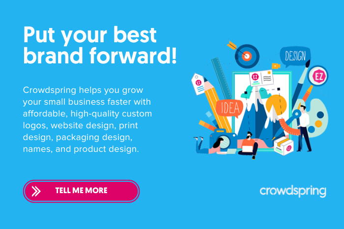
For example, HubSpot offers free marketing resources that people can download when accessing their blogs. Crowdspring provides a comprehensive brand identity guide that helps small businesses and startups unlock the secret to faster business growth.
Use a few clear and concise short sentences in your copy to avoid confusing people.
5. Present a problem, then offer a solution
Customers want a quick answer to their needs. So, leverage relevant problems from your target audience by offering a solution in your call-to-action.
This simple tactic attracts people because people want quick solutions. Follow these three steps to write compelling copy:
- Pick a problem
- Intensify the problem
- Offer a solution
6. Leverage social proof
People want to belong and don’t like to get left behind. Social proof pushes people to follow trends to feel validated.
Use this powerful psychological principle of social proof to your advantage when writing your CTAs.
Trends and memes are good examples of social proof.
You can showcase social proof in many ways. For example, list the number of subscribers to your newsletter, people who have used your product, customer reviews, and more. Social proof helps build credibility for your brand and urges people to check what your product or service is about.
For example, we publish tons of real client testimonials on the crowdspring reviews page to show the feedback we’ve received from tens of thousands of satisfied customers.
7. Offer bonuses
People love rewards. Bonuses offer one of the most effective ways to lure in people through your call-to-action.
Marketers often offer referral bonuses, while eCommerce businesses provide coupons or discount codes when buying their products. Either way, it’s a win-win situation.
Offering limited-time-only bonuses or discounts can help add a sense of urgency. This feeling of scarcity helps grow your revenues.
8. Utilize cliffhangers
A cliffhanger is a proven tactic that compels people to click on your CTA. It’s a fast way to incite curiosity.
But there’s a fine line between cliffhangers and clickbait.
Cliffhangers are best used when you want to share a piece of content. Companies that promote on social media do it best. A short and curious caption is an effective way to lure in curious people.
Four compelling CTA examples and why they work
1. GiftRocket

People are bored of traditional greeting cards. GiftRocket stands out because of its unique way of sending out a gift.
The website doesn’t ask customers to sign up before sending a gift. You can immediately click the “Send a GiftRocket” button to customize your gift and then register last for payment.
This instant gratification allows customers to skip the hassle of registering first, which can sometimes deter people from pursuing the action.
3. Apple

Simplicity often works best in capturing people’s attention. And Apple does it best.
Apple leverages high-quality and crisp images with a simple caption to captivate people. The “Learn more” button stands out despite its simplicity with the smart use of white space.
4. Webflow
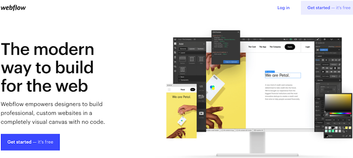
People love seeing the word “free.” So, follow Webflows’ example and include it in your call-to-action if you allow free trials.
There are discounted trials, and then there are free trials. People want free. Discounted trials allow people to use all your advanced features, while free trials only allow people to use basic features.
Free trials are best used for services such as software, editing tools, and more. These services are hard to grasp if only done through images. People need to test out these services first for their worth.

5. Glossier

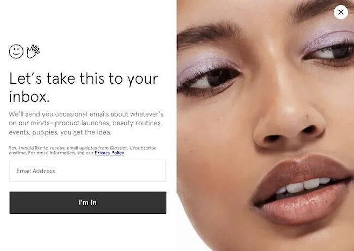
Most people are lazy. If you want them to sign up for your newsletter, make it quick and easy like Glossier.
People signing up before getting access to information often deters them. It’s an added step that many are not willing to take.
So, allow them to subscribe to your newsletter easily through your call-to-action. But people often won’t subscribe unless you can show them quality educational content.
Be sure to invest in writing quality content first to show off your expertise. Good content helps build credibility for your brand and increase website traffic.
The best CTAs are specific, clear, and urgent. But maintain a balance between urgency and clickbait. Be concise and honest, and highlight how your brand can help.


